


Well, I am just underwhelmed by the response to my 4-way meme post. Oh well, guess my regular life is not that exciting.
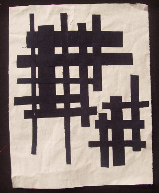
Now back to our regularly scheduled posting. It is time for the third set of exercises from the Color and Composition book. This set involves composing with lines and shapes. First we have two compositions using straight lines. In the first the lines are to be parallel to the edges of the foundation. I chose an asymmetrical composition.
In the second, none of the lines were to be parallel to the edges. I chose a diagonal composition: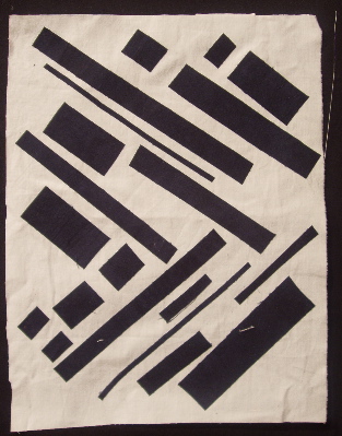
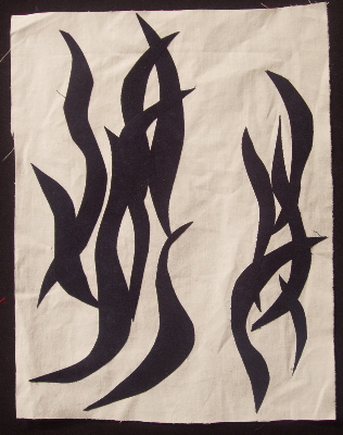
The third composition uses curved lines in various lengths; again, I chose an asymmetrical design.
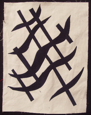
For the fourth composition, straight and curved lines are combined.
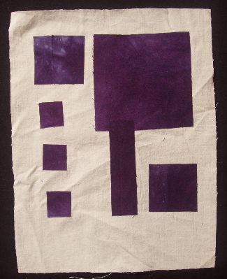
The second exercise involves composing with shapes. The first is made up of various geometric shapes in one color. I meant this to be symmetrical.
In the second, another color is introduced as a focal point, using the same shapes as the first composition.
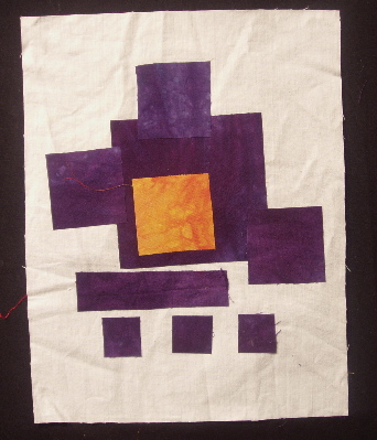
I really enjoyed doing the line compositions. I found it fun and challenging. I was less thrilled with the shape compositions.
Today, I attended the local Surface Design meeting. I got some great feedback on my latest work – great for the ego. I have a goal of getting the studio cleared out of excess fabric and other stuff by Tuesday so that Mr. C can paint the wall where I have had my design wall and clean the carpet. Maybe I will take some pics of before and after and maybe not. Right now it looks like a disaster area as I make my piles of keep, store, give and throw away.
Love the line compositions. Line line line – very appealing!!!!
And purple – who can’t love purple!
I had the same thought as DebR about putting your B&Ws together in a banner format. FYI, when looking at the B&Ws the words came to mind, Friction and Fire.
The black and white compositions are stunning…very successful. Some of the color composition seem to lose the strength of the black and white. Also enjoyed your meme…as Jen said I think we were all over invovled this week end but loved your answers even though I didn’t comment.
I have a feeling everyone just had a busy weekend, like me, and that’s why there weren’t many comments. Jen
Have you tried hanging your compositions on your design all all together like Kristin did? Just curious.
I don’t think anyone got a lot of responses to the meme! (The only reason I think I got ANY comments was people asking to be tagged) Seems like those sorts of things are fun to read, but don’t start much of a conversation. I’ll comment that I could DEFINITELY get into dinner and a movie with you!! 🙂
What I’ve learned from your exercises, and Kristens, is that the combination of straight and curved lines appeals to me the most.
I liked the line compositions better too. Your first one turned out especially well. I like it far better than my attempts at asymetrical. And what’s NOT to like about hand dyed purple fabric?! The book didn’t specify that the focal color in the last exercise be a complement, but sure works well that way.
I think we all enjoyed reading each others’ memes, but couldn’t stop to comment as we had to hurry off and blog our own 😉
I liked the line compositions better too. Your first one turned out especially well. I like it far better than my attempts at asymetrical. And what’s NOT to like about hand dyed purple fabric?! The book didn’t specify that the focal color in the last exercise be a complement, but sure woeks well that way.
I think we all enjoyed reading each others’ memes, but couldn’t stop to comment as we had to hurry off and blog our own 😉