


Bit by bit and little by little, I am divesting myself from all the stuff that filled my days here in Sonoma County. Today was the annual meeting of my parish and the new Rector’s Warden was announced – and of course, it is not me. I am staying on the vestry until we move, but I am kind of a lame duck member. But, yeah! No more Tuesday morning meetings with the Rector.
I am feeling somewhat giddy with freedom. I know that there is a lot of work ahead, getting ready to move and the actual move, but I think it will be an exciting time. I am really focusing on finding a great space for a studio in our new house. Every time Mr. C shows me another listing, I ask, "But does it have a daylight basement?"
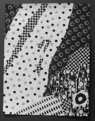
Today, I did my achromatic focal point composition. It was the same as the monochromatic, except I used black and white prints in a 7-step value run. I am not as happy with this – not sure why.
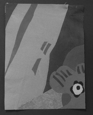
I changed the monochromatic into a gray scale composition just for the fun of it and this is quite cool:
Katie’s book talks about black and white quilts and the visual impact that they can make. Here is one that I did for Mr. C a couple of years ago.
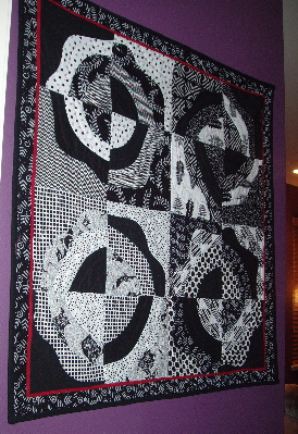
This is in a narrow entry into his office so I had to take the pic on an angle. I used a variety of black and white prints mixed with solid black. I layered four fabrics and cut curves and wavy curves and then reassembled the pieces into four new blocks. I have a huge stash of black and white fabrics because it took many to do this.
Tomorrow I think I will do some machine quilting on my ufo’s.
Hi there, nice design, keep up the good work.
I like Mr. C’s quilt. Good luck with the house hunting.
The quilt for Mr. C is rather fabulous against that purpe (graple!) wall!!
Mr. C is one lucky guy!
Love the gray scale…the problem with the black and white study is the print confuses the value. On my screen the black and white prints read all the same pattern so the shapes disappear….not at all like Mr. C’s quilt which is too cool.