home
about the artist
gallery
blog
links
contact

Archive for the ‘art crush’ Category

Day 8

Tuesday, December 8th, 2015
Krystal Nacht  by  Robert Natkin

Krystal Nacht by Robert Natkin

Since I have been unable to get to my studio, I thought I would share some art I love, with you. I just recently discovered this abstract artist and I love, love his work. This is a link to his website. Love his use of color and the interesting shapes.

Robert Motherwell, At Five in the Afternoon, 1950. Oil on hardboard.

Robert Motherwell, At Five in the Afternoon, 1950. Oil on hardboard.

I was also delighted to find that there is a collection of Robert Motherwell’s Elegies at the de Young. We are heading to the bay area after Christmas so this is on my to see list. We own a Motherwell signed print so I am looking forward to seeing more of his work. This is our piece hanging over the fireplace.

fireplacearea

I picked up my bionic knee brace today.

bionic knee

I could only wear it for an hour today and add an hour each day with a max of 8 hours. On my initial use, I think it is working. Now I have to figure out what I have in the way of pants that will fit over this.

rainydayviewfromgym

And this happened – more rain and more flooding, mudslides and sink holes in the Portland area. It is so warm, I fear that the snow will have left our mountains.


Painting Water

Wednesday, January 19th, 2011

The Surface Design Association has a non-juried members’ show at the conference. The theme for the conference is Confluence, as in the meeting of two bodies of water. The conference takes place in Minneapolis where I assume two rivers meet. The title of the members show is Merge and Flow, another water reference. The piece is to be 12 inches by 26 inches, either vertical or horizontal.

I plan to do another piece like the sunset piece I did for one of the Twelve X Twelve themes. I painted the organza with several different blues and blue-greens. I placed a piece of silk under the organza which will be used as the base of the quilt.

It has to be done and photographed by Feb 1 so I must get busy. I plan to do some more surface design to the organza with some metallic paints. Then I can start cutting and sewing the little pockets.

I found a new art crush.  Her name is Ivelisse Jimenez from Puerto Rico. Her work is fascinating to me. Great color, complex layering, architectural elements, mixed media – really cool.

Ivelisse Jiménez uses painting as a point of departure to construct pieces that deal with the idea of simultaneity and contradiction. The manner in which objects, images and materials are articulated questions the hierarchies of what is most present.

The work consists of structures made out of a diversity of elements partially covered by a veil of acetate or plastic. This wall/screen serves as a connector that stops or ejects the viewer by making impossible frontal access to what is behind. The blurring of the outside panel unifies the singulars into a whole element. We can still view the inside where the elements are shown as irreducible and coexistent. Perception is relative and dependent upon the position from which it is viewed. The spectator must negotiate a series of points of view. The images are constantly shifting between integration and disintegration. They refer to the body/mind decision making process of finding a method to make something present. Jiménez is interested in structures that are parallel which exist in other configurations such as language. This act of synchronizing is finally a metaphor for the elusiveness of the balance of factors that determine the production of meaning.

So, when I saw the first piece up there, it reminded me of this piece that I made a while ago which I love, but which never gets into any show. Maybe I should start using the actual construction fence!!


Back in the Studio & New Artist Crush

Tuesday, January 4th, 2011

I finally broke through the morass that was holding me back from getting any work done. It is not earth shaking or very imaginative, but I cut, fused, sandwiched and stitched up two possible pieces for the next Twelve x Twelve eggplant  color play theme. The three colors are eggplant, wine and emerald green. I have posted a couple of sneak peeks. The top piece is silk organza and the other is silk dupioni. None of the colorways is perfect, but I am trying to have fun and get as close as I can. I may do a couple more pieces until I feel that I have the right combination of colors.

Another plan that I have this year is to find artists whose work speaks to me and to find out a bit about them. I recently came across the work of Beatrice Mandelman (1912-1998). She started her career in New York, but eventually settled with her husband in Taos in  19944 where they were part of the art scene. Here is photo of her at work. I was intrigued that all of the photos of her working show the work on a table rather than an easel.

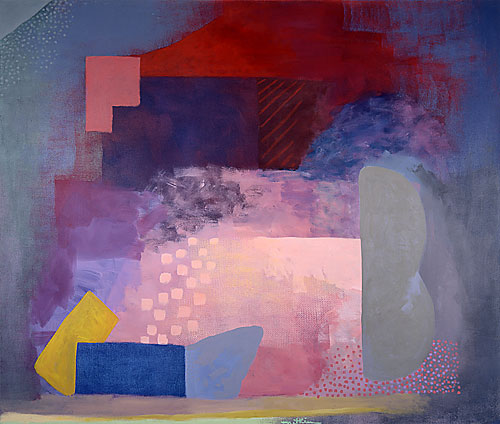
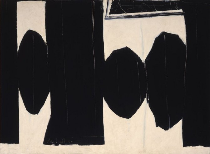
Much of her work is in large, bold, colorful amorphous  and wonky shapes.

Untitled from the Space series: 1972

Blue Moon; undated, 1960s

Jazz II, 1986

I love her fearless use of color and the shapes that are repeated.

The following is from and article in Art & Antiques Magazine, Dec/Jan 2011

Despite Mandelman’s considerable distance from modern art’s most active centers, her work is noteworthy for its strong affinities with certain artistic developments of its time. Much of it is a fusion of post-Cubist, gestural-abstractionist techniques; much of it is also a record of her experiments with bold, often primary, colors and ambiguously emotive forms. Mandelman’s art could be quiet and meditative in light-toned compositions featuring gentle washes of layered-on color or boisterous and rollicking in paintings like those of her late-career Brazil or Jazz series, with their patches of black and bold, solid hues.

In the 1980s, Mandelman said, “I’m an original. I broke all the rules. I’m using a very primitive language—squares, circles, triangles, primitive colors. And I made a very sophisticated art out of it.” Years later, she added, “I don’t have an external story in my paintings, and that’s difficult for people to accept.”

Mandelman had a strong sense of herself and her achievements, even if big-name success eluded her during her lifetime. In 1971, after a Taos gallery presented an exhibition of work by women artists that was emphatically ignored by the media, she quipped, “If we’d thrown our bras into the Río Grande, we could have gotten all the attention we wanted.” Later on, she told an interviewer, “My own painting turns me on. I feel it in my heart, the same feeling I get when I hear good music….I’m trying to work from chaos into order, stripping away, using the basics; that part is intellectual. We’re all different, but I think all real artists are working toward the same thing.”

“What’s that?” her questioner asked.

Mandelman replied, decisively, “Freedom.”

That last paragraph tickled me. She was definitely a woman who knew herself and with a wicked sense of humor. You can read the whole article here.