


I know I promised to post more of my work from Liz’s class – Better Art by Design. I have a class on Church History on Monday nights so I have heavy duty homework and the class to attend. We got home at 9, and I decided to watch “On Becoming Jane” instead of blogging. It was an OK movie. It took some time to capture my interest.
Without further ado, here is some of my work from week 5. The themes were rhythm, repetition and gradation. For this week, we started working in a larger format. The previous exercises were typically done on a 4 X 6 card.
The first assignment was to create 2 compositions to show rhythm using vertical and horizontal lines. I decided to use the same fabrics for both.
Here is the horizontal:
And, vertical, which I had to rework – very slightly. Can you see the subtle change in where the black lines end in the center. They were lining up in the first one.
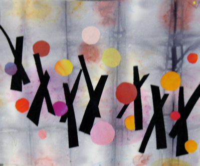
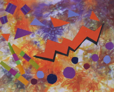
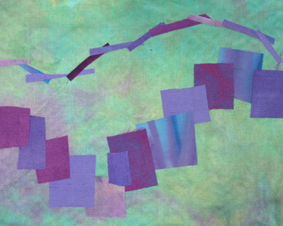
In the next exercise, we were to create 2 compositions showing rhythm using music.
Here is Jazz before and after a fix:
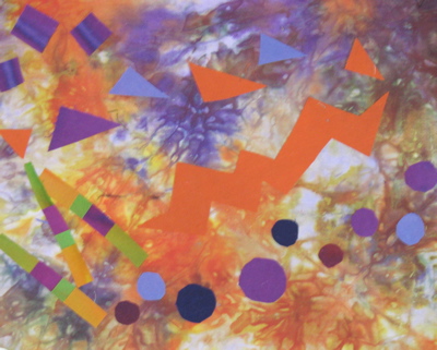
This is Lullaby:
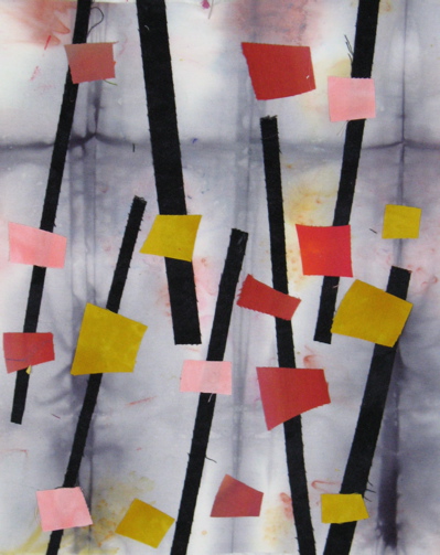
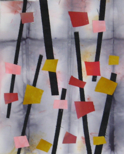
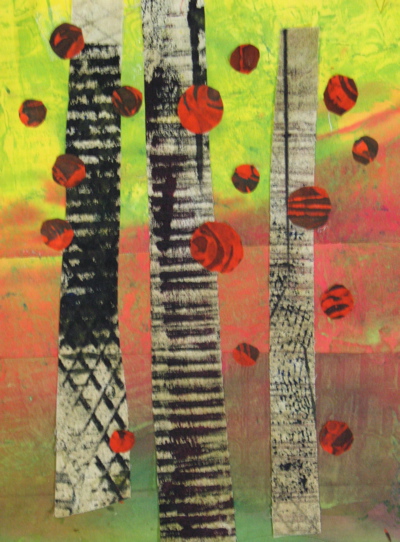
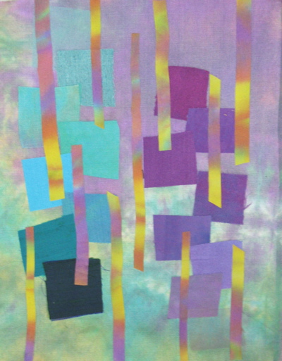
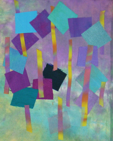
For the next two exercises, I used two pieces that I started in a class with Rayna, last spring. They have been languishing on my reserve design wall, waiting to be finished. Here they are after using what I learned in Liz’s Better Art by Design class (click to find the info about her next class).
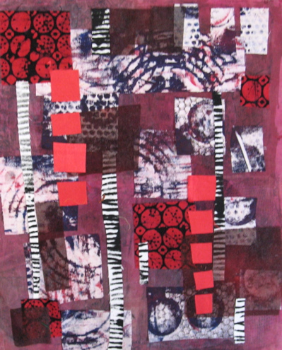
In the last exercise, we were to use subtle gradations of color and value from one area to another. I have reworked this one.
I have not heard back from Liz, yet, so I am not sure if I nailed this one yet. You can see more student work on Liz’s blog.
Those are all fabulous pieces Gerrie, but I’ve got to say that the two with the pieces from Rayna’s class are my favorites! They are awesome. But then I am torn because I love the jazz piece….and then there’s the lullaby….and then the awesome first pieces! I’d say you get an A+++ in that class!
xo
Thanks to you I have signed up for the next class…..
Hugs,
teri
Love Jazz and lullaby. Can’t believe how much the black under the orange changes the entire look. It’s like outlining a drawing. Wonderful work Gerrie. The first Rayna piece is just gorgeous-looks like trees.
The black makes that zigzaggy orange piece in Jazz really sing. Good idea. I love your fabrics from Rayna’s class. Awesome!
Well, I think you nailed it! I really appreciate the fact that you have taken time to incorporate some of the critique ideas into your work. In this way you have been able to judge for yourself which you prefer. This revised pieces are great! And thanks for the wonderful plug! You can by my PR person anytime!
Liz
Looks like you are soaking up lots of good info in Liz’s class. I really like your first Rayna-fabric piece. It’s somewhat landscape-y, but still totally abstract, and I think it controls all of the texture in the black/white fabric well. The red “bubbles” are just plain fun!